Columns
Column Header Renderer
The headerRenderer property in Graphite Grid specifies the component that
renders the content for a column's header. If no custom renderer is provided,
Graphite Grid uses a default renderer. This default renderer is sufficient for most applications,
especially if the cells contain only textual information.
function FoundedRenderer<T>({ column }: HeaderParams<T>) {
return (
<div
style={{
display: "flex",
justifyContent: "flex-start",
alignItems: "center",
gap: 8,
width: "100%",
height: "100%",
backgroundColor: "rgba(255, 0, 0, 0.2)",
}}
>
<svg width="24" height="24" fill="currentcolor" viewBox="0 0 256 256">
<path
d={`M256,136a8,8,0,0,1-8,8H232v16a8,8,0,0
,1-16,0V144H200a8,8,0,0,1,0-16h16V112a8,8,0,0,1,
16,0v16h16A8,8,0,0,1,256,136Zm-57.87,58.85a8,8,0,0,1-12.26
,10.3C165.75,181.19,138.09,168,108,168s-57.75, e
13.19-77.87,37.15a8,8,0,0,1-12.25-10.3c14.94-17.78,33.52-30.41,
54.17-37.17a68,68,0,1,1,71.9,0C164.6,164.44,183.18,177.07
,198.13,194.85ZM108,152a52,52,0,1,0-52-52A52.06,52.06,0,0,0,108,152Z`}
></path>
</svg>
{column.id.toUpperCase()}
</div>
);
}
export function HeaderRendererGrid() {
const grid = useGraphiteGrid({
initial: {
columnDefinitions: [
{ id: "company-name", headerLabel: "Company Name", field: 0 },
{ id: "founded", headerLabel: "Founded", field: 1 },
{
id: "employee-count",
headerLabel: "Number of Employees",
field: 2,
headerRenderer: FoundedRenderer,
},
],
// other props
},
});
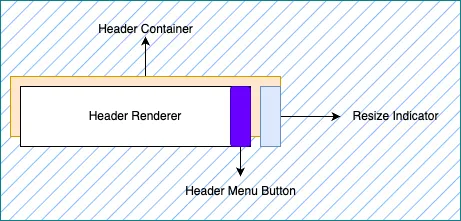
}The Anatomy of Header Cells
Graphite Grid wraps the content returned from headerRenderer within a
column header cell. This approach ensures that all standard grid
functionalities, such as sorting and keyboard navigation, are maintained. When
developing a custom renderer, remember that it will be rendered inside a
container managed by Graphite Grid.
This container might be mounted and unmounted multiple times, especially as users scroll horizontally. Therefore, ensuring that any renderer provided to the grid is efficient and does not include costly initialization code is crucial.
Caution
React hooks, such as useState, can be used within the headerRenderer.
However, be aware that the header may be frequently unmounted and remounted as
the user scrolls horizontally, affecting the state management within the
renderer.
By leveraging the headerRenderer property, you can create custom header
components that suit your application's specific needs. The custom renderer
provides flexibility in styling and displaying header content while maintaining
the standard grid functionalities. However, it's important to keep in mind the
performance implications and the potential impact of horizontal scrolling on the
renderer's lifecycle.